Assignment 5 – feedback, response, rework and reflection.

My tutor made a number of observations after our tutorial:

  • The book format and print quality and finish are acceptable but the photograph black borders are not necessary. The borders are there to prevent the images from bleeding off into the paper white, but I will remove them for the assessment submission.
  • Where sky is included it distracts from the ‘layered’ nature of the planes. I will crop to remove the sky and see how it looks
  • The concept of the work should be further explained along with how the idea developed. This is in the later ‘Reflection’ part of this post.
  • The book submission should contain only assignment work. I’ve split the work into two small books, one for the coursework which was submitted as print, the other containing Assignment 5.
  • Try another sequence to improve the flow of images. The version for assessment has been resequenced with improved flow in mind

Rework

I have slightly cropped the images to remove sky where it was intrusive, along with reprinting the borderless versions.

Reflection

As mentioned earlier in the Assignment 5 post, this started off as an investigation into how the edges of planes can work to enhance the impression of depth in a two dimensional image.  I concluded that it can and does and that it isn’t difficult to do.  I looked at how painters had used the techniques and utilised them in a digital form.

After a short while I began to find the images sterile and uninteresting; they were simply too precise, too angular and edgy. To use a bit of medical black humour, the operation was a complete success but the patient died.

I have learned that technique can swamp creativity and that in this case I was taking photographs to satisfy a technical requirement.  I should have been more willing to open up to other aspects of the basic idea and be prepared to modify or even ditch completely the original intention.

I also need to take many more photographs, which I hope will not only afford more choice in editing but also encourage in-project experimentation.


Part 4: Feedback, research, reflection


My tutor didn’t feel that a re-edit would be particularly fruitful on this assignment but suggested that the work of David Moore, Frederick Evans and Peter Marlowe may be usefully studied along with Jem Southam and Paul Seawright among others.

David Moore (UK, b?)


The Last Things

“I don’t understand how you’ve got this far” MoD official,

Between September 2006 and April 2007, supported by Arts Council of England, David Moore worked in a secure military location below ground in central London. This space will be used as the first port of call in any situation where the safety of the country is under threat. The Ministry of Defence allowed David Moore an unprecedented level of access which has enabled him to observe a live working space, continuously on standby, and fully prepared for the most extreme national emergency. The Last Things develops ideas about the institutions of government and the manifestations of power first seen in The Commons (Velvet Press 2004). ” David Moore: The Last Things. http://www.davidmoore.uk.com/words/diarylastthings (accessed June 19, 2017).

David Moore photographed his project “The Last Things” in a very flat, matter-of-fact style which belies the dramatic purpose of his subject.  The very normality of the approach serves to emphasise the enormity of the circumstances under which this facility (and presumably others like it) would be put to use.  The facility is all about people and the protection it aims to provide for them, but Moore’s images are distinctly unoccupied;  this allows the grim quotidian fixtures and fittings to speak for themselves.

Although the quote above refers to the images demonstrating manifestations of power it may be thought that they actually show a deep vulnerability, the extent to which defences, materials and systems may be required to preserve life.

Frederick Evans (UK 1853-1943)

Evans photographed mainly architectural subjects and was at pains to maintain a straight, unmodified print:

“Profoundly dedicated to pure photography, he never altered the printing of negatives for aesthetic effects; rather, the eloquence of his images comes from his ability to capture the supremely expressive viewpoint at the most telling moment of light and shadow.” Philadelphia Museum of Art . http://www.philamuseum.org/collections/permanent/66293.html (accessed June 19, 2017).


1970-31-24-dig2015

A Sea of Steps,” Wells Cathedral, Stairs to Chapter House and Bridge to Vicar’s Close   Frederick H. Evans

The light in this part of the building is astonishingly delicate and graduated.  Evans would have been using a large format camera with full movements to allow for a sympathetic rendering of this scene in accordance with his vision – itself a ‘manipulation’ but one with which Evans must have felt comfortable.

Peter Marlow (UK 1952-2016)

image   image   image   image

Marlow’s series ‘the english cathedral’ adopts a fixed and repeated viewpoint for each image.  In every case he sets the shot up to look down the knave to the chancel, using a wide angle lens (presumably with view camera movements to correct perspective distortions) to include the gospel and epistle sides along with the roof rafters ( I had to google all that!)

It has some of the features of the Bechers’ typologies but the grandeur and intricacy of these interiors prevents them from assuming any kind of humble functionality.  The forms are concealed by the shear density of adornment.

Jem Southam (UK 1950)

28 May 2003  January 2001  Vaucottes, November 2005

“Photographer Jem Southam makes rural landscape images that document man’s intervention in nature. Photographing the same locations over months and years with a large format camera, Southam records transitions as they unfold. In “The Pond at Upton Pyne” series, taken from 1996 to 2001, Southam captures the maintenance and neglect of a pond that was once a manganese mine in the 1700s. More recently, Southam has photographed the cliffs of the English Channel in majestic large-scale works like Senneville-sur-Fecamp, April 2006 (2006).”

Artsy. https://www.artsy.net/artwork/jem-southam-vaucottes-november-2005 (accessed June 19, 2017).

I have difficulty connecting with this kind of work and Southam’s offerings are no exception.  I can see the point – the slightly incongruous evidence of human intervention in the small details, the imposter materials in the bucolic landscape but the ‘majesty’ of it eludes me.  I find them utterly unengaging, but perhaps they need to be seen for real as large scale versions.  There is an almost autistic element to work which is executed on large format negatives over a five year period, featuring a single pond.  I think that’s it in the middle, above.

The absence of a consensus about how best to appreciate deadpan photography has not hindered its dominance. For many young photographers, particularly on BA and MA courses in the 2000s, the set of variables modelled by Düsseldorf photographers appears to be a fail-proof formula; simply choose a subject (preferably something that comes in many variations) and shoot a taxonomy
using a uniform composition and immaculate technique. Instant art!  Some critics and historians would argue that it is in perfecting a formula – both formal and conceptual – that a photographer establishes the rigor and relevance of their project. Others would say that work in this vein is so monotonous, predictable and static that it is just plain dull.

Lucy Soutter Why Art Photography?  (Routledge 2013)

I would suggest that the formula Soutter identifies along with whatever rigor and relevance it confers is a perfectly valid process but often it still results in ‘plain dull’.  I hope that as I progress through the course I will become more enlightened and appreciate photography such as this more fully.

Paul Seawright

cage1belfast         Seawright Cage2.jpg         Gate.jpg

Belfast  –  Produced during a two month residency at the Irish Museum of Modern Art in 1997. Seawright returned to Belfast to make work about locally produced defensive architecture on the edges of housing projects in North and West Belfast during the early stages of the ceasefire.”

Belfast — Paul Seawright. http://www.paulseawright.com/belfast/ (accessed June 19, 2017).

Thematic photography which documents a certain aspect of the built environment; it’s gritty, factual and offers an interesting commentary on the way that the normal use of buildings becomes subverted by untoward circumstances.

In the series “Police Force”  Seawright adopts a similar approach to David Moore in his work above, showing the bland deterioration of items and fixtures found in RUC operational premises.  It’s unavoidable to contrast the content of these pictures with the drama and intensity of the events in which they played a peripheral part.

Black chair.jpg  Police watchtower.jpg  Target.jpg

Reflection

Looking at this work and considering my own in this part of EYV I have noticed how the connections begin to form.  No work is produced in a vacuum and each individual image takes its place in the photographic firmament.  Some images appear isolated and others are easily placed in galaxies which share common characteristics.  It seems possible that they will all make a contribution no matter how small, even if their significance is appreciated only by their maker.

Learning about the process employed by other practitioners is very interesting – how it got there is sometimes more relevant than how it ended up.

Feedback, research, reflection


Tutor feedback and re-working

Following tutor feedback I was encouraged to rework some of the images in colour.  Here are the results

EBP2022587EBP2032594EBP2032601EBP2032602EBP2032605

The colour is intentionally muted as I was interested in preserving the texture and tonality – colour seems to interfere with this for me and I don’t know whether it’s just a preference or a personal visual anomaly.

The image of the endives brought up an aspect of visualising that I’d come across in a film called “Tim’s Vermeer”.  The film chronicles an attempt by the inventor Tim Jenison to discover the techniques Vermeer used in his paintings. One segment, an interview with Sir Colin Blakemore, Emeritus Professor of Neuroscience at Oxford University, deals with how the human visual system perceives real time tonal gradation;  for example in the way reflected light ‘falls off’ from a source – say a window – all the way across a wall into the shadow areas.  Because of the way Vermeer’s paintings capture this effect, Jenison wondered if Vermeer was peculiarly talented in his perception and asked Sir Colin whether Vermeer could have been “some sort of savant”:

Tim Jenison: “What if someone said… maybe there’s a savant, who’s so smart that he could figure that out”

Sir Colin Blakemore: “He’s not smart… he’d have to have a very strange retina.  The retina is an outgrowth of the brain.  It’s a very complicated structure in terms of its nervous organisation… the signals go through a complicated network, several layers of different types of nerve cells before they finally get back to the last cells in the chain whose fibres make up the optic nerve. [so the system employs] a very clever trick for reducing information…”

Tim’s Vermeer (2013) Dir: Teller; High Delft Pictures LLC

The trick is a form of ‘bandwidth limiting’ whereby small incremental alterations are ignored – filtered out.  This is perfect for economy of brain power “… but a disaster if you want to know about the appearance of a scene”

This graphic shows the effect:

Image result for visual trick similar shades

Squares “A” and “B” are the same tone but looking at the left chequerboard you wouldn’t believe it.  Only when an adjacent comparison is made is the true density apparent.

When I first saw the endives under muted daylight the lighter tones appeared to be just white.  Only when I looked through the camera viewfinder did I see the spread of tones.  In this way the camera is functioning as a viewing tool, enabling the observation of something which the naked eye cannot render.  A similar function is observed in the camera’s ability to expand or contract time using long or short exposures.

1 “Flor” Flor Garduno 2002 Edition Braus

Reflection

This assignment has given me the opportunity to learn about the way that light and shadow combine to give depth and shape to an image.  It isn’t always what you might expect.  After a slight nudge I have produced some colour work which worked quite well with the chosen subjects.  I have pushed the brief boundaries and the sky did not fall in. 

Exercise 5.1 The Distance Between Us


Brief:

Use your camera as a measuring device. This doesn’t refer to the distance scale on the focus ring(!). Rather, find a subject that you have an empathy with and take a sequence of shots to ‘explore the distance between you’. Add the sequence to your
learning log, indicating which is your ‘select’ – your best shot.  When you review the set to decide upon a ‘select’, don’t evaluate the shots just according to the idea you had when you took the photographs; instead evaluate it by what you discover within the frame (you’ve already done this in Exercise 1.4).  In other words, be open to the unexpected. In conversation with the author, the photographer Alexia Clorinda expressed this idea in the following way:

Look critically at the work you did by including what you didn’t
mean to do. Include the mistake, or your unconscious, or whatever
you want to call it, and analyse it not from the point of view of your
intention, but because it is there

Of all the exercises in EYV I found this one the most troubling – I just couldn’t decide on the right subject matter.  I went through (and photographed for)

~  Ideas about the sea, having had a pretty close relationship with it for the past five years

~  about my immediate surroundings, but that was a bit too much like Assignment 5

~  visitors to the seaside town where I live

I couldn’t raise much enthusiasm for any of them , except perhaps the first, but I have a feeling I will use that idea elsewhere.  Then I was reading an article about diptychs and Sergei Eisenstein and his ideas around juxtaposing imagery.  It was a groundbreaking notion at the time, that cutting one shot against another could elicit a response in the audience which each shot individually could not.

Eisenstein applied Marxist historical perspective to his developing theory of montage, whereby a historical action or event precipitates another event with resulting consequence – in his terms, thesis, antithesis and synthesis.

I thought I could play around with this to make something interesting so I enlisted some local talent to produce the following photographs.

1


2


3


OLYMPUS DIGITAL CAMERA


People are talking and they’re somewhat concerned….  they’re talking to each other but they are not talking to you.  So are they talking about you?  Or someone else and they’ve noticed you listening?  What do the direct gazes suggest – suspicion?  Or have they really been talking about you – they certainly seem to be looking knowingly your way.  Or perhaps it’s someone else entirely who’s the subject of their earnest discussion.  Do you know them?

And so on…….

The diptych presentation is intended to produce synthesis from two disparate images, leading the viewer to form conclusions of their own making.

Reflection and learning

This was simple to set up but tricky to edit.  We used a seafront shelter and a couple of speedlights in the failing light (getting the talent together at the same time restricted my options).  All shot from a locked-off tripod to try to keep the image size the same.  The problem in editing was keeping the eyelines at the same (almost) level and the head sizes similar. 

It worked pretty well.  I’m pleased to have got something from idea to print (oh yes, there are prints) in a record short time for me, just a couple of days.  I spend too much time cogitating and need to concentrate on producing more work rather than better work.  Not that it shouldn’t be as good as I can make it but I must stop allowing perfect to be the enemy of good!

Unfortunately in following this idea I have indulged in a bit of ‘brief-battering’ and part of the direction has not been fulfilled – I haven’t made just one select and nor have I chosen a single image with unexpected content.  There is  such material in the contacts, a rather nice moment occurring between the offspring as I was faffing with lights.  Here it is:

OLYMPUS DIGITAL CAMERA


Contact sheets:

ContactSheet_001 ContactSheet_002

Assignment Five – Planes, Edges and Depth in the Urban Environment

This assignment was submitted in print form to my tutor so the same book forms part of my assessment submission.

Brief

Take a series of 10 photographs of any subject of your own choosing. Each photograph
must be a unique view of the same subject; in other words, it must contain some ‘new
information’ rather than repeat the information of the previous image. Pay attention
to the order of the series; if you’re submitting prints, number them on the back. There
should be a clear sense of development through the sequence

For the last assignment in EYV I have chosen to produce a small book of photographs and text which looks at how perspective depth is perceived in the two dimensional image and how this may be used in the representation of the urban landscape.

Firstly I should say that in embarking on this line of enquiry I soon discovered that I had bitten off a good deal more than I could chew, bearing in mind the amount of work time I should have sensibly allocated to the assignment.  Although I found the learning interesting I realised that I had swum rather too far from the shore and getting the actual photography and printing done took more effort than was warranted.

Through talking to my tutor I concluded that a physical submission was a good idea for the final assignment so I settled on the idea of a book format.  I could have sent the images away for printing but I’ve not had much success with this in the past, the results often being somewhat lacklustre and not infrequently dreadful.  The submission is mirrored on this blog.

It’s all about the edges…”

Making sense of a flat image may seem simple and intuitive but is in fact a complex process:

“The camera and the retina see the same luminance in an image, which is a combination of reflection (in the words of [Edwin] Land, “the language for delineating objects”) and illumination (“the language for displaying illumination”). The visual cortex in the rear of the
brain processes this luminance signal from the retina, separates reflection and illumination, and recombines them in a very special
way to show us the world as it truly is, visually. The brain first detects edges, separating those edges into illumination edges and reflection edges. Then, it uses complicated algorithms to process the image into our perception of luminance, called luminosity or brightness. This is an important point, and bears repeating: Be mindful of the difference between actual luminance and our perception of luminance, called luminosity. An unprocessed image direct from the camera is a straight luminance image, hence the disparity between what we visually perceive and what we get in a photograph”  (My emphasis)

George Dewolfe in Presence — George DeWolfe. Retrieved June 11, 2017, from Web site: http://www.georgedewolfe.com/pdfs-other-downloads/

Dewolfe examined a number of paintings by acknowledged masters and converted them to monochrome, the better to observe the way that visual planes were delineated and emphasised to give the illusion of three dimensional depth.  He noted that edge contrast, layered soft and hard edges along with opposing tonal values combined to produce this effect, a fact known to painters for hundreds of years.  He worked out how this technique may be applied to photographic images to give more convincing perspective and ‘presence’ and I’ve attempted to implement this in these photographs.

File:Theo van Doesburg Composition XXII.jpg

Theo van Doesburg – Composition XXII (1920)

In the painting by van Doesburg (above) the flat planes are abutting each other but by clever use of edge effect and emphasis an appearance of ‘layering’ is achieved. In this example the effect does not appear coherent – each plane can be seen to move forwards or backwards according to the way that the visual process manipulates the forms.

The Inaccessible City

I was interested in following through with the idea of the flaneur and what partially hidden views may make themselves visible during saunterings in the backstreets of a city.  We don’t have any local city so I made do with some nearby towns, seeking out aspects of the built environment which presented themselves as plane-on-plane structures with a strong sense of perspective.

“The modern flaneur navigates the visual excess of the urban terrain, as new perspectives spring up everywhere like so many sideshows, as the everyday life of the city is compressed into socio-historical structures of the spectacle. The flaneur becomes a visual sampler of commodity culture, piecing together a multifaceted city and refracting it through the artist’s prism of the visual fragment. Surrounded by surfaces and flattened perspectives on all sides, the flaneur’s sense of space no longer accords with the views of classical geometry,”

Unmapping the City: Perspectives of Flatness – Edited by Alfredo Cramerotti  – Intellect  2010

The material shown in the photographs is inaccessible but visible, though the limited opportunity for a varied viewpoint imposes restrictions on the way the picture may be composed – it’s not possible to change the view much because you can’t get to where you’d like to be, there are too many houses, sheds, walls and fences in the way. 

“The versatile photographer is taken by the city and goes with the flow, a semiotic transformer in the ‘journey-form’, grasped as the rhythm of perspective. The photographer, like the DJ, scratches the surface of the photographic record and interferes with the visual coherence of the city, producing differential perspectives from those laid down by the ‘ordered diagramming of the cartographer”

Kern in Harvey 1989: 267 Harvey, D. The Condition of Postmodernity: An Enquiry into the Origins of Cultural Change, Oxford, Blackwell, 1989

Evaluation and reflection

*   This series of ten images was the result of an investigation into how depth can be conveyed along with an appreciation of the way that towns are constructed.  I delved rather too deeply into the technical and theoretical aspects but managed to surface before becoming overwhelmed.

*   I decided to submit monochrome prints because I could more easily control the appearance of the prints

*   I’ve been considering the way that images are viewed currently – so many photographs, so few pictures – which led me to ponder the idea of simple book presentation.  I’m also thinking about whether files deserve to be printed and bound even though they may be far from perfect and whether this may contribute to my developing visual skills.

*   The treatment of the edges and planes does give a sense of depth and perspective which was not as noticeable in the originals so I am satisfied that this approach has some validity in photography.

*   Despite the foregoing positive results I am disappointed in the photographs themselves – they do what they are intended to do but I don’t really like them much.

Seaton 1 axm 2 axm2 backs planes-Recovered Brid 1 Lyme 2 Lyme 3 lyme 4 lyme 5 rous 1

Ex 5.3 Cartier-Bresson’s ‘Behind the Gare Saint-Lazare’ and the Pivotal Point

Look again at Henri  photograph in Part Three. (If you can get to the Victoria & Albert Museum in London you can see an original print on permanent display in the Photography Gallery.) Is there a single element in the image that you could say is the pivotal ‘point’ to which the eye returns again and again? What information does this ‘point’ contain?   Include a short response to Behind the Gare Saint-Lazare in your learning log. You can be as imaginative as you like. In order to contextualise your discussion you might want to include one or two of your own shots, and you may wish to refer to Rinko Kawauchi’s photograph mentioned above or the Theatres series by Hiroshi Sugimoto discussed in Part Three. Write about 150–300 words.

I had the opportunity to see an original print of this photograph at the HCB Foundation in Paris earlier in the year.  My impression of the print was that it’s small and quite high contrast.  Somehow I was expecting something rather bigger and more dramatic, but the size of the thing does invite close inspection thereby establishing a certain intimacy between the viewer and the image.  So here is the photograph in question:

time-100-influential-photos-henri-cartier-bresson-behind-gare-saint-lazare-18

The print proportions (3:2) suggest that this is an uncropped image from a 35mm negative although I haven’t seen the contact sheet. The predominant pivotal point is the space between the man’s foot and its reflection – the tiniest space remains at the split second immediately before the foot hits the water and disrupts the mirror-like reflections.  The information here is primarily the unavoidable fact of a wet shoe.  . This is a much-studied photograph and other resonant points have been isolated; the reflection of his other foot just touching the ripples produced by his spring from the ladder being just one, the echo of the dancing figure on the poster another. Additional information can be easily extrapolated, limited only by the bounds of imagination but for me the content of the frame is sufficient.  It simply doesn’t need further dismantling or analysis because this would interfere with the honesty and simplicity of the photograph  HCB took this without looking through the viewfinder (he poked the camera through a fence) and when speaking of it was at pains to emphasise the importance of serendipity in photography rather than taking credit for impeccable timing and composition.

From my archive:

DSCF6208 The dog poked his head out for just a brief moment and I was almost quick enough to get a sharp shot – but not quite.

 DSCF6695This couple appeared to by studying carving but it seems that their sightlines have diverged somewhat.

Both the above images are happenstance shots whose value rests in oddity and humour. Each has a pivotal point (no pun intended) to which the eye returns repeatedly.  Neither of them are likely to grace the walls of the V&A, however,  because they have no satisfying  internal geometry or enduring compositional value.  But I won’t let that put me off.

Ex 5.2 – An Homage, a Response

Cala lillies are peculiarly graceful flowers, the shapes of the petals following classic Fibonacci lines.  Being white they can reflect subtle light and show their shape in a very elegant fashion.  They have been subjects for two photographers whose work I find particularly engaging: Robert Mapplethorpe and Imogen Cunningham.

062N09129_5VYLN

Imogen Cunningham

96.4380_ph_web

Robert Mapplethorpe

These are in B&W, which would be my inclination also, but in trying to explore different approaches I’ve kept this in colour:

OLYMPUS DIGITAL CAMERA

They were lit simply with window light through a muslin curtain and a little bit of reflector fill from the lower right.  110mm (equiv) lens stopped right down to f16 to gain some depth of field.  The contact sheet shows the settings but not the aperture which was the same in each case.  I was a bit disappointed with the lilies’ performance, exuberance-wise; they remained stubbornly furled despite being left in the sun.  They cost £4.50 each as well, but I expect they’ll last a while on the window sill!

As for earlier homages I’ve had periods of interest in street photography in the past – here are a couple of my images from the Spanish city of Cartagena:

                                                         DSCF6598        DSCF6637

These fall easily into the run-of-the-mill street categories of perspective humour and poster incorporation.  They are quite amusing for a time but they don’t have any staying power and although I have quite a collection I now find them rather dull.   The Spanish like to talk in close proximity and become deeply involved in their conversation, which makes photographing them quite easy – one is rarely noticed.

Going much further back into my personal archive (how grown-up to think of it now as an archive; only last year it was a folder!) I unearth this image from around 2004:

DSCN1044

I recall being amused by the fact that the fencing had no sides but at the time I had no idea I was treading closely behind Mssrs Strand and Ormerod thus:

strand_the_white_fence_port_kent_1916    picket fence

Paul Strand ~ White Fence, Port Kent, New York 1916                                                                           Michael Ormerod: Untitled, Undated


ContactSheet_001

5.1 – What makes a photograph work?


It’s tempting to assign an undeserved measure of veracity to a photograph;  after all it represents something which actually existed for the duration of the exposure, so surely it can be relied upon to speak honestly of the circumstances of its production.  The flaws in this assumption are carefully exposed by Terry Barrett in his contribution to  Aesthetics. (Goldblatt, D. and Brown, L. (2011).Upper Saddle River, N.J.: Prentice Hall/Pearson Education)  The photograph is inherently ambiguous to a greater or lesser extent and the information it conveys can alter according to the information which surrounds it.

Here is an example of a photograph which is at one end of the ambiguity scale:

Image result for queen  wreath whitehall

How many interpretations can we place on this image?  How far can we stretch the meaning, given the unmistakeable cues?  A certain amount of knowledge is required to interpret the image ‘correctly’ – we need to recognise the main subject and agree that it is indeed the Queen and not a lookalike.  The stonework of the form to the left, the presence of red flowers and the attire of the background figures all combine to reduce the ambiguity level of the picture.  It’s just about credible to assign unsubstantiated meaning – “Queen struggles up cenotaph steps” because we don’t see her gait in the times before or after the exposure and there are any number of other subtle variations which could be sustained, but the main substance of the message is clear:  it’s the wreath laying at the cenotaph on Remembrance Sunday.  It depicts a single  moment so it would be unwise to assume that the rain held off all day, or that Philip was close by, but on the whole the visual elements combine to convey a degree of certainty.


image

Doug Bubois – My Last Day At Seventeen

Here is an image form Duboi’s series about under-18’s.  He was interested in the improving prospects for this age group and his series examined their social and economic prospects as they reached their majority:  Jennifer is a proud new homeowner, buying with a hefty deposit donation from her father and her girlfriend’s mother.  The house was a bit run down when she and her partner Carol bought it nearly a year ago but it’s in an up-and-coming area and they have worked hard to bring it up to the decorative standards they aspire to.  They’ve transformed the kitchen and main bedroom, the hall and stairway (behind, blue) where they were pleased to find original balusters after removing some hideous panelling.  They are preparing the walls in this room for painting.  She’s wearing old clothes for the dirty work (though she hasn’t got any really old jeans, having donated nearly a dozen pairs to the nearby charity shop).  They’ve filled some damaged parts of the wall and she’s returning from the kitchen with an old pan containing of sugarsoap water for wiping down the walls. The photographer (Dubois) has been in the way a bit and she’s trying to find a way of politely asking him to let  them get on with it.

All of which is nonsense, but not nonsense of course, because the above interpretation is just as valid as that which is inferred when the viewer becomes aware of the context surrounding the production of this series.  On its own the image is highly ambiguous because there are few cues which can be gleaned to form a reliable interpretation.

All photographs fall somewhere on this ‘ambiguity scale’ and the vast majority of them some way towards the ‘nebulous’ end.

Then there is the question of intent – that of the photographer in making the image.  The theory of intentionalism, whereby the meaning of an image is determined by its maker has been generally dismissed by most postmodern photography critics.  It is widely held that an image means what the viewer makes it mean,  an assumption which may be regarded as conveniently excusing the maker of any responsibility for content.  However there is a sound logical rationale for this view in that we, as viewers, cannot help but see an image with both our eyes and our memories.  Pictures at any position on the ambiguity scale can have their meaning modified and the emotional import skewed in the light of the observer’s experiences.

So for the majority of photographs context is a vital aspect of the way in which they ‘speak’ to us, being at the same time perfectly simple yet at the same time immensely complex.

Assignment 4 – Languages of light


Natural, artificial (environmental), and studio (of a sort in my case) light each have very different characteristics and choosing one type for an assignment involved a lot of thought.  Initially I was attracted to the night time light of towns and did some investigative photographs of a local supermarket:

P4283255   P4283257   P4283270   P4283269

This would have been outside my normal choice of subject so I was interested to see if I could persuade myself – but no, I was comprehensively underwhelmed.  I thought of night time garages in the George Tice vein:

Image result for night filling station tice

George Tice: Petit’s Mobil Station,” Cherry Hill, NJ,

The monstrous water tower is a significant component of this image and we don’t have them so much in Devon.  It’s B&W as well and I am making myself work in colour for the time being.  I thought of launderettes too, an idea I have had for a while but as with the other night exteriors we’re at the wrong time of year.  I visualised bright launderettes with steamy windows on a rainy street in the pitch black so that may have to wait until November.

I wanted a settled, calm look to the light so in the end I chose to do some interiors in a local church, partly because I knew that the quality of the light was very delicate and quiet.  It’s a pleasant place to work because there’s so little chance of interruption and you can always have a sit-down to contemplate matters photographic.  This is Askerswell church in West Dorset.  The windows are very tall and face north and south (obviously) giving a slight variation in the light.  They aren’t deeply stained, in fact there isn’t much colour from them at all – they have a wide uncoloured margin which lets in a good deal of diffuse daylight.

ContactSheet_001

Again, I would not normally choose church interiors as a subject but these images are much more about the light than the content. There is a soft gradation apparent in all the shots, a long tonal scale which allows for detail to be present in the shadows without the highlights being over exposed.  The velvet of the curtains fairly glows and the folds themselves show a pleasant rhythmic progression across the frame.  I was tempted to crop to a square format but I wanted to show some of the objects with a background ‘context’ rather than square in the centre.

The ambient light level was low because the day was partially cloudy; windows to the south side were brighter than those opposite but not by much.  I wanted to retain a reasonable depth of field so that the background tones didn’t dissolve in to a general blur, so apertures were quite small, leading to long exposure times.  I used the trusty tripod for all the exposures.  The images appear as JPG’s here but they started as RAW files so I was able to slightly modify the black/white points.  I set the white balance once and didn’t change it – the colour temperature was quite consistent throughout.

OLYMPUS DIGITAL CAMERA   OLYMPUS DIGITAL CAMERA   OLYMPUS DIGITAL CAMERA

OLYMPUS DIGITAL CAMERA   OLYMPUS DIGITAL CAMERA   OLYMPUS DIGITAL CAMERA

OLYMPUS DIGITAL CAMERA

I would prefer to see these in a ‘gallery’ presentation but I think WordPress only allows a restricted choice of views.  Also I thought I’d lost a lot of work just recently because I’d been playing around in the mechanism so I shall leave well alone for the time being.

My favorite of the selection is number five; I did open up the shadows a little in the middle but, apart from that, these are pretty much straight out of the camera.  I am going to resist the temptation to render them in B&W and just get familiar with them as colour images!

Part 4 Project 2 – Layered, Complex, Mysterious

Again this section does not call for written work, rather it points to some photographers for reference.  I looked at the ASX Sally Mann (USA 1951-) interview too.  I have long admired her photography and her working ethos, the latter having being challenged for her depiction of her children – or rather of her unclothed children.  She has been accused of ‘abusing’ her offspring by portraying them in this way, the suggestion being that she caused them harm in later life, particularly as they grew through their teenage years.  When her ‘Immediate Family’ show opened in New York (1992) some reviewing publications refused to include images they considered ‘innapropriate’.

” When The Wall Street Journal ran a photograph of then-4-year-old Virginia, it censored her eyes, breasts and genitals with black bars. Artforum, traditionally the most radical magazine in the New York art world, refused to publish a picture of a nude Jessie swinging on a hay hook”

The Disturbing Photography of Sally Mann – NYTimes.com. Retrieved Apr. 30, 2017, from  http://www.nytimes.com/1992/09/27/magazine/the-disturbing-photography-of-sally-mann.html

1984-1991     1984-1991    1984-1991

Mann claimed that it never bothered her children and they themselves concurred. This is a difficult area because I know from working in child protection myself that children will often dismiss any suggestion that they were treated inappropriately and in any case abuse does not rest on acknowledgement by its victims.  But I look at the matter in an artistic and photographic context and find myself wholly in favour of Mann’s approach.  She endured continuing criticism but persisted, going on to produce further significant work including ‘At Twelve’.  Sally Mann was a founder member of the Continuum Group, a photographic alliance which included Ted Orland and David Bayles, co-authors of the inspirational book  “Art and Fear”.

But anyway…. on to the quality of light aspect – Mann at this time preferred to work at certain times of day and also in certain seasons – all the work was photographed in summer, while the winter months were reserved for printing and finishing.  Her daylight preferences are clear from the images she has made – the light is subtle, shady and most evocative of the family farmland where the pictures were made. She uses atmospheric haze to emphasise foreground subject matter and shallow depth of field to further differentiate the background.  In her Southern Landscapes series it’s not clear whether the vignetting is a result of a printing technique or the covering power of the lens.

                      1992-1996  1992-1996

Southern Landscapes  Sally Mann 1992-1996

If Sally Mann seeks out the moody contrasts, Michael Schmidt (Germany 1945-2014), on the other hand,  isn’t at all keen on shadows.  He wants a flat light so that the components of the image are able to express themselves without interference.

“His photographs are remarkable for their near complete absence of chiaroscuro – their colour schemes always seem to float in between the two extremes of black and white, caught in the grey and ambivalent middle, just like Berlin was caught between the political poles of East and West.”

Remembering Michael Schmidt | AnOther. Retrieved Apr. 30, 2017, from Web site: http://www.anothermag.com/art-photography/3644/remembering-michael-schmidt

He was also considered exceptionally talented in his sequencing of images:

“Mr. Schmidt expressed his goal in arranging pictures as “1 + 1 = 3,” a coinage illustrating his belief that juxtaposing a series of photographs greatly increases their emotional power.”

Douglas Martin  on Michael Schmidt, 68, Maker of Photographic Narratives, Dies – The New York Times. Retrieved Apr. 30, 2017, from Web site: https://www.nytimes.com/2014/06/11/arts/michael-schmidt-photographic-storyteller-dies-at-68.html

  Michael Schmidt, Untitled, 1980  Michael Schmidt, Irgendwo, 2001-2004

All images – Michael Schmidt

Michael Collins (India 1961-) seeks the same flat, shadowless lighting for his work, which he considers to be ‘record photography’. I saw him present and talk about his work at The White House in Sherborne a few years ago and he won’t entertain the idea of shooting in sunlight, preferring to allow the drama to emerge of its own volition without the emphasis of contrasty light.

    M6 1 

All images: Michael Collins

The rightmost image above is titled “Derelict Houses, Stoke”, which I find deeply evocative of my teenage years spent in the Potteries.  The properties are more than derelict, they are abandoned, hopeless and without purpose like much of the Stoke-on-Trent of my youth.

Exercise 4.4 – Using light to reveal form

Photographs need light and light takes many forms – the way in which light strikes a surface, the nature of its source and how it is modified before reaching the subject all influence its appearance.  For this exercise I chose the form of my Glamorous Assistant and used the somewhat unorthodox light provided by a hand-held fluorescent tube.   The idea was to produce a diffuse source and have it very close to the subject to let it ‘wrap around’ the form.  This made pressing the shutter awkward as I ended up being some distance from the camera, so I set the shutter to a 2 second delay whilst I assumed the desired lighting position.  It also meant that I couldn’t see through the viewfinder, though I was able to get a good idea via the LCD screen.  This is what happened:

(gallery is moved down

because it obscures dropdown menu items –

please keep going

down the page!)

This slideshow requires JavaScript.

The camera position remained static but I moved the light around from the right, round to the left. I added a piece of cardboard to the far edge of the light fitting to flag off the background and make it dark  I’ve converted these to monochrome because I found the skin tones distracted from the tonal effect.

Although the effect of moving the light position is very noticeable I didn’t really get on with the method.  The light was soft but polarised (in the sense of directional);  it was meant to emulate a striplight softbox but the ‘strip’ aspect was too narrow

Christian Coigny – Men & Women. Retrieved Apr. 25, 2017, from Web site: http://www.christiancoigny.com/artwork-portfolio/43-men-women/image/#524

I am influenced by Christian Coigny, as well as Timothy Greenfield-Sanders and Gregory Heisler for their use of light in portraiture.  It looks very simple and natural but I have a feeling that much of their work is carefully built up layer by layer. Notwithstanding this I find the results pleasing.  I notice how the background is illuminated to produce a ‘rhythm’ of light and dark across the image – where the model has a dark edge, the backround is light and vice versa.  This accentuation of edges helps to give depth cues to the eye/brain where they do not occur in a 2d photograph.    Here’s a lighting diagram for my shots as above:

UntitledI used a 28mm (56 – 35equiv) lens at F4 for all the photographs; the shutter speeds were slow, around 1/4 second because the light was only 30 Watts.

To summarise, it produced an informative result but  it doesn’t really work as a lighting resource.  I quite like the idea of BIG window light and we have double floor-to-ceiling glass doors in our current accommodation so I hope to experiment a bit with that quite soon.

Assignment 3–Tutor feedback, further reflection, research and reading

Following our telephone tutorial I have followed up the suggestions made by my tutor:

1. Re-edit Assignment 3 images after considering Paul Graham’s work “A Shimmer of Possibility”  –  you can see the re-edited set here and my observations on Paul Graham below.

2. Read Geoff Dyer’s “Ongoing Moment” – see below

3. Read David Campany’s “Cinematic”  – ibid

4. Read Merlin Coverly’s “Psychogeography” – ibid

1. My Assignment 3 involved working from a moving river boat, photographing the movements and activities of people on the embankment.  The work prompted my tutor to point me at the work of Paul Graham and suggest I re-edit the sequence bearing his approach in mind.

Paul Graham (UK, 1956- ) is an English photographer whose series “A Shimmer of Possibility” comprises twelve books of photographs taken in America between 2004-6.  They consist of up to twenty-six  images in each book, taken on visits to between two and four cities per book; one volume, Camarro, Louisiana has a single image. I haven’t yet been able to get my hands on a set of these volumes so I’ve only been able to view some of the work as single images online – the layout and sequencing of the books is therefore beyond my reach just now.  The photographs depict strangers moving through the frame and past each other. Graham remarked:

“Perhaps instead of standing at the river’s edge scooping out water, it’s better to be in the current itself, to watch how the river comes up to you, flows smoothly around your presence, and reforms on the other side like you were never there.”

A shimmer of possibility. Photographs by Paul Graham | MoMA. https://www.moma.org/calendar/exhibitions/321?locale=en (accessed April 14, 2017).

Image result for paul graham shimmer  Related image  Related image  Related image

Related image   

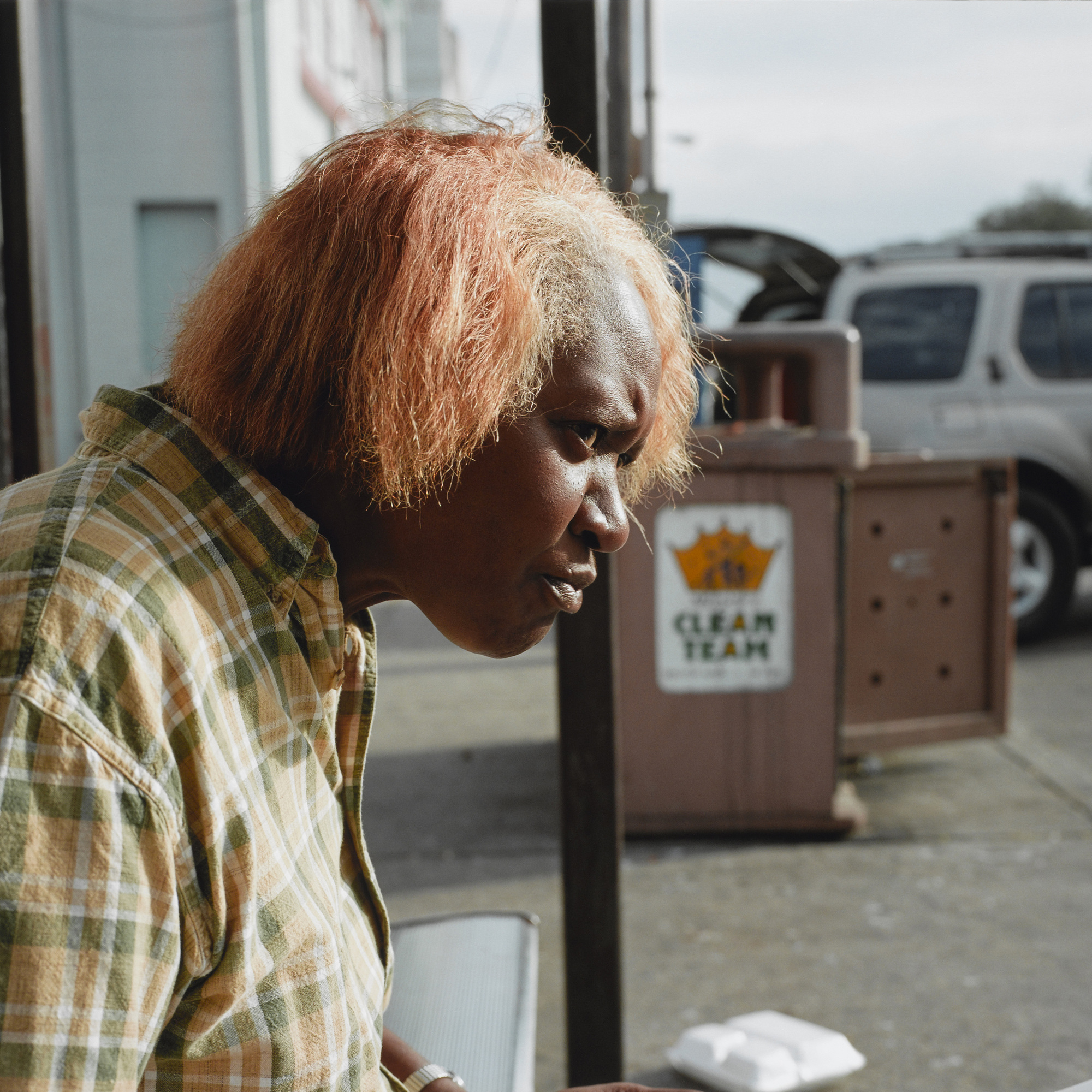
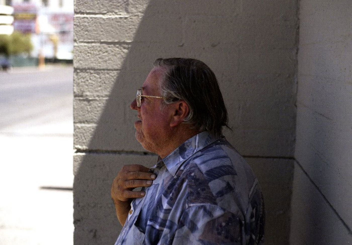
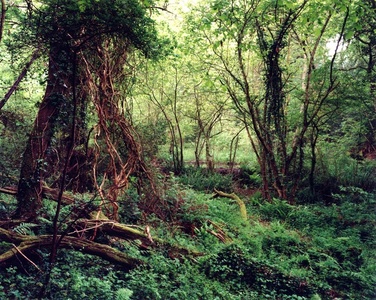
Graham has made a bold statement with his choice of presentation – a book with just one photograph in it…?  The choice must be intended to convey some meaning, or at least be important to Graham himself since it involves considerable expense; one would expect a project such as this to be bound in one volume, even if it were separated into chapters for each city group. My view is that he wanted to emphasise the difference and individuality of the places even though there may be little to differentiate them in the images themselves.  Relating this to my own work for this assignment there is a common thread of happenstance – the content occurs for only a fleeting instant but in that time a microcosm of the place is set in the photographic frame.  The unique ability of the photograph to record tremendous detail allows the viewer to contemplate and explore a single moment for a protracted period, revealing layers of information in what at first may appear to be a mundane image.

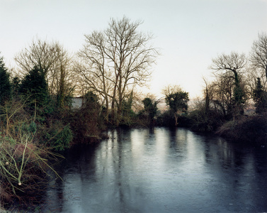
Assignment 3 – Re-edit

DSCF3638 DSCF3777 DSCF3640  DSCF3749 DSCF3762 DSCF3784 DSCF3756 DSCF3764 DSCF3780 DSCF3637 DSCF3763 DSCF3806

2. The Ongoing Moment – Geoff Dyer

Dyer’s presentation is somewhat unusual in that the body of the book, some 250 pages, consists of just one chapter; the book is indeed ongoing. It’s declared purpose, to make a ‘survey of photography’ follows ‘earlier well-intended attempts to marshal the infinite variety of photographic possibilities in to some kind of haphazard order’ and takes the form of a series of discussions about the works of all the ‘name’ photographers since the invention of the process.

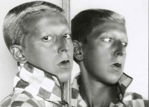
Dyer mixes incisive observations and historical facts with his own interpretations of the works featured.  For example, here he discusses Andre Kertesz’s  “Broken Bench, New York, 20 September, 1962”  [shown below]:

DP265757

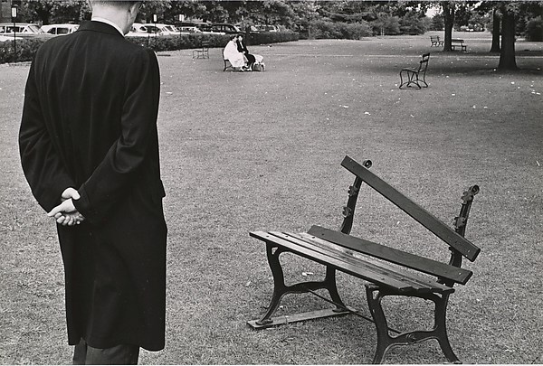
On 20th September 1962, in New York, after all those long years of snubs and slights, Kertesz took a photograph that summarised his own situation – or his own perception of his situation – perfectly. Near the top of the frame two women seated on a bench; in the distance is scattered an assortment of empty chairs and benches.  A third of the frame is completely dominated by the back of a man in an overcoat looking down at a broken park bench.  It is quite possible that after enough knocks and disappointments your favourite bench could mean almost as much to you as a pet dog or a wife once did.  Pathetic?  That’s the point: how sad it is that there are people for whom a bench could mean the difference between melancholy and breakdown.

He  goes on to enlist the help of Philip Larkin (always gleeful to assist in matters of melancholy) with a few lines from Larkin’s poem ‘Toads Revisited’:

Turning over their failures

By some bed of  lobelias

Nowhere to go but indoors

No friends but empty chairs…

It’s fair to give Dyer some latitude in the extent to which he assigns meaning and inferences to an image and I think these fall just the right side of outlandish.  They take on some extra validity when he later explains that the figures in the photograph are Kertesz’s wife Elizabeth and a troubled young woman whom they had elected to support; the overcoated figure is Elizabeth’s business partner.

Dyer cleverly teases out lines of influence at work between photographic contemporaries, explaining and illustrating similarities in their images and in their approach to photography.  This line of investigation helps to weave a human element into the fabric of photographic progression throughout its twentieth century evolution.

His perceptive observations regarding his subjects are scattered throughout the book;

On Walker Evans “Time passes through his camera”

On Kertesz and Winogrand “Kertesz was accused of saying too much in his pictures; Winogrand’s don’t let you get a word in edgeways”

On Edward Weston “As if photography weren’t exhausting enough, there were the practical difficulties posed by the sheer number of women throwing themselves at him”

And for William Eggleston “ [his] photographs look like they were taken by a Martian who has lost the ticket for his flight home and ended up working at a gun shop in a small town near Memphis”

The book is an entertaining and penetrating look at the lives of these photographers, placing them squarely amongst the preoccupations and social concerns of their time.  I give it 9/10 (but only because the illustrations are rather poor quality)

3. Cinematic – David Campany

This is a collection of essays written on the relationships between the still photograph and the moving image.  In this volume Campany has collected a wide range of viewpoints from a variety of authorities and the discourse ranges wide and deep.  Photography has its fair share of academic dissectors but they pale beside the output of film theoreticians; there is no connection too tenuous, no assertion which cannot be tortuously validated.  I have the PDF version of this book and I find it difficult to read on-screen so I will find a paper version and carry it forward for study when my comprehension has matured somewhat.

4. It was suggested that I look at the concept of the flaneur and psychogeography.  I was casually acquainted with the flaneur notion, a friend having once suggested I was behaving like one I did a little research and found I agreed with her assessment. To me a flaneur  has a number of qualities:  an unhurried pace, leisurely but not without direction; dressed in a way which doesn’t draw undue attention (though the rather flamboyant Dandyism is connected in some aspects with flaneurism); an attitude which allows for the absorption of the surroundings and the inhabitants.  It is essentially an urban pursuit, requiring a connection with buildings, public art, street artefacts and to a lesser extent passers-by,

In a photographic context the flaneur takes on the additional function of collector, recording experiences and observations made during his perambulations.  It suggests a more thoughtful and considered approach than the genre of street photography and may involve an appreciation of the mundane or even the banal.

Psychogeography I found a good deal more slippery.  I located a PDF of the Merlin Coverley book but found the style difficult to read as it continually refers to other texts to establish the points it wishes to make.  Not having read these other books I struggled with it, but grasped enough to get a sense of the main aspects.  A more accessible outline found in the Wiki entry helped me to understand further. As this relates to my own work, it may encourage me to photograph what I see rather than what I want to see.  Perhaps undirected photography, like the undirected movement associated with psychogeography, may produce work worthy of examination at a later time. Although the physical activity of movement in a psychgeographic fashion may be random, sometimes a framework may be applied in order to produce a track which is deliberately but predictably different to the usual a-to-b route:

Participants walk an algorithm or fixed pattern, such as “first right, second left, first left, repeat.” In other words, you head in any direction, take the first right, then go two blocks to the second left, then at one block take a left, and then repeat the pattern as often as you wish. The result is a remarkable style of travel — neither goal-oriented nor random, structured but always surprising.

A New Way of Walking, http://www.utne.com/community/a-new-way-of-walking (last visited Apr. 23, 2017).

I can understand the fascination of this form of urban discovery and why it would appeal to its early French protagonists.  For myself, I have no difficulty in achieving satisfyingly random movement in any environment especially urban; the difficulty arises in finding my way home.

NPG workshop with Kate Peters–8/9 April 2017


I attended a weekend workshop at the National Portrait Gallery, led by Kate Peters around the theme of ‘mask’ and ‘disguise’, in conjunction with an exhibition called Gillian Wearing & Claude Cahun: Behind the mask, another mask.

Gillian Wearing makes extensive use of prosthetic masks to produce images which show an real person –  herself – presenting as a different person, usually a family member or an acquaintance.  The masks she uses have developed over time from simple and somewhat primitive to very expensive and sophisticated.  In each image, the only real visible facial feature are the eyes.

Wearing has made this approach her own and has produced a wide range of work using the technique.  She has always used herself as the subject, for example in a large series of polaroids taken over a period covering her late teens.  They are the printed version of the modern ‘selfie’ but with less face-pulling.

My personal response to the majority of her later work is mixed.  While the early work was innovative and fresh I feel that the continued use of the mask device does little to advance and explore her photography.  Her earlier self portraits seem to have more authenticity and less artifice, perhaps because they were the work of a younger, less well-formed artist. The connection between Wearing and Cahun is rather more tenuous than might first appear; I bow to the curatorial experience of the NPG but having put some time into reading about Cahun and Wearing I think that apart from the superficial similarity of some aspects of their work they have little in common. Perhaps that was never the purpose of the exhibition.

Claude Cahun (her birth name was Lucy Schwob) met her lifelong partner and artistic collaborator Marcel Moore (born Suzanne Malherbe) at age 15;  Moore was three years older and they were together until Cahun’s death in 1954 at the age of 64.  Virtually all of Cahun’s photographic output featured just Cahun herself, though Moore is occasionally in shot either as a figure or a shadow. It seems reasonable to suppose, given their shared artistic interests, that Moore was actively involved in contriving the images, indeed many appear to require an assistant to make the actual exposure.  Wearing’s collaborations seem to extend only to engaging the professional services of prosthetic mask makers.

Both Cahun and Moore were deeply influenced by their personal, artistic and social circumstances.  It is generally accepted that they had a lesbian relationship and it is known that Cahun rejected the wealthy Jewish background into which she had been born.  She was associated with the nascent Surrealist movement but was not accepted into their circle until her first and only exhibition in 1932.  Their departure from Paris to Jersey was precipitated by the rise of Nazism and anti-Semitism, ideologies to which they were both vehemently opposed.  They continued their passionate resistance to the German occupation of Jersey by placing subversive notes into soldiers’ pockets and vehicles, a scheme which resulted in capture and imprisonment until the liberation of the island in May 1945. Incarceration took a heavy toll on Cahun’s health and she never fully recovered.

Cahun explored her ideas about gender representation through her work, a theme which I suspect was underpinned by her own sexual orientation.  Although she is now known as a photographer she was recognised in her time as an author; her photographs were, in the main, never intended for public consumption and although captioned in books and exhibitions as ‘self portraits’ she herself did not title her work.  In these, as in so many respects, her artistic processes and influences share very little with those of Gillian Wearing.

Image result for claude cahunImage result for claude cahunImage result for claude cahunImage result for claude cahunImage result for claude cahun

Work of Claude Cahun & Marcel Moore

Image result for gillian wearingImage result for gillian wearingImage result for gillian wearingImage result for gillian wearing

Work of Gillian Wearing

In the NPG exhibition one is confronted with the substantial differences in the scale of the prints.  Cahun’s work is tiny, no more than half postcard size and seems to be contact prints from roll film negatives.  There is an intimacy of scale here, the images are all monochrome and because of their size it is necessary to view them up close – they invite near examination and as a result they establish a proximal relationship with the viewer.  Wearing’s work, on the other hand, is many times larger and lacks the modesty implicit in Cahun’s prints and it is necessary to stand a good distance off to see them comfortably.OLYMPUS DIGITAL CAMERA

The two-day workshop comprised eleven attendees of mixed ages and experience.  I was pleased to meet another OCA BA Photography student there!  Following introductions and a tour of the exhibition we set about constructing and photographing our own ‘masks and disguises’.  We used Fuji instant film to produce prints, then bleaching the backing part of the peel-away to obtain a scannable negative. We also made digital photographs of the work, printed instantly on a little Canon Selphy printer.


P4093144


The following day we were assigned the task of making digital street portraits with a ‘film’ limitation – LCD viewfinder turned off or blanked (no chimping) and only twenty shots allowed.  The challenge of approaching strangers was made somewhat easier by working in mixed M/F pairs although the sunny warm weather and the words ‘for the National Portrait Gallery’ probably helped.  Those we approached were happy to be photographed.  My co-photographer had the foresight to bring some business cards which helped with the interactions.  I must get some made myself.


In the afternoon we were able to use Kate’s own equipment and lighting to photograph each other and a model provided by the gallery.  This was a good opportunity to observe how an accomplished practitioner approaches portraiture in natural and artificial light. I learned a great deal from the workshop:

  • Cahun and Moore’s lives as collaborative photographers
  • Wearing’s career path and development
  • Interacting with other workshop attendees and learning from their varied experience and approaches
  • Studio techniques with natural and artificial light
  • Alternative instant film processes
  • Tethered photography with medium format cameras and digital back
  • Approaching strangers for portraits in the street

P4083114P4083116OLYMPUS DIGITAL CAMERA

Exercise 4.5


The brief:

Make a Google Images search for ‘landscape’, ‘portrait’, or any ordinary subject such
as ‘apple’ or ‘sunset’. Add a screengrab of a representative page to your learning log
and note down the similarities you find between the images.
Now take a number of your own photographs of the same subject, paying special
attention to the ‘Creativity’ criteria at the end of Part One. You might like to make
the subject appear ‘incidental’, for instance by using juxtaposition, focus or framing.
Or you might begin with the observation of Ernst Haas, or the ‘camera vision’ of Bill
Brandt.
Add a final image to your learning log, together with a selection of preparatory
shots. In your notes describe how your photograph differs from your Google Images
source images of the same subject.

I chose to search “cars” on Google because it’s a broad term which could return a wide variety of results.  As it turned out the results were very similar:

carCapture

The deep dark workings of Google are not particularly relevant to this exercise but I was struck by the homogenous nature of the images; they are all of new cars, shiny cars, cars dynamically positioned and photographed in the studio, many being on white backgrounds ready to be dropped into composite images.  Nothing like the real cars which constitute the overwhelming majority of examples.  I assume that there are many more images of this type online than there are of my elderly Picasso.

That screenshot may be considered to represent a style of car photography which is designed to emphasise the aesthetic appeal of the shiny, purposeful modern vehicle.  But the images are intended to imply much more than that; they suggest all manner of rewards and benefits for the aspiring owner.  Driving a vehicle like this will surely fulfil all the aspirations of the (male, for such they generally are) prospective purchaser.  Family life will be joyous and stress-free.  Lesser individuals will gaze enviously as the sleek shape takes effortless charge of the outside lane.  Customers will eagerly await its arrival, keen to place unfeasibly large orders;  promotion to divisional manager must surely follow.

I was interested in the contrast between this and the inevitable destination just a few short years later so I headed to one of several ‘Vehicle Recycling Facilities’ in my area, chosen to exploit a relationship I have developed there through nursing a number of elderly vehicles well beyond their natural life.

My creative input to this exercise involved a different way of looking at cars, one which is not often encountered. At first I planned to seek evidence of occupation by owners and families and I was indeed able to do this, but as the shooting progressed I became interested in the rather abstract reflections still to be seen in what remained of the windows.

Here are the contact sheets (click to enlarge, then zoom in with your viewer):

ContactSheet_001ContactSheet_012ContactSheet_022

I chose to shoot landscape format and the occasional portraits represent moments of forgetfulness.  I could have cropped to match but decided not to use them anyway.

Here’s my initial selection:

P4032985P4032993P4033000P4033009P4033011P4033020P4033024P4033034P4063061P4063072P4063076P4063098P4063105

I’ve selected this image as my personal choice from the exercise:

OLYMPUS DIGITAL CAMERA

There is a lot going on in this photograph and it can sustain a longer than normal gaze.  At first it appears confused and somewhat abstract but as elements become identifiable I feel that it does work in telling a story.  I am particularly pleased with the inclusion of the mirror reflection at the middle right edge, showing the detritus from hundreds of previous vehicles on the soil. The plastic container is a bit of a distraction but I decided to leave the scene as-found.

Technical notes:

All made with an Olympus OM-D E-M1, exposure details are captioned on the images.  I used a ‘legacy’ 28mm f2 Kiron lens which equates to 56mm (35mm equiv).  This allowed me to control the plane of focus to my preference.  I might as well sell the precious Olympus “pro” zoom because I rarely use it.  In fact I did have a go with it at this location (the images show the f no in the caption) but I didn’t like the flat, technical appearance.  Some of the interiors were quite gloomy but once again I was able to make shake-free exposures at slow shutter speeds thanks to the IBIS.  OK, enough geekery already.

Exercise 4.3–The Beauty of Artificial Light

 The brief:

Capture ‘the beauty of artificial light’ in a short sequence of shots (‘beauty’ is, of
course, a subjective term). The correct white balance setting will be important; this
can get tricky –but interesting – if there are mixed light sources of different colour
temperatures in the same shot. You can shoot indoors or outside but the light should
be ambient rather than camera flash. Add the sequence to your learning log. In your
notes try to describe the difference in the quality of light from the daylight shots in
Exercise 4.2.

I’ve done a few indoor exercises so decided to look at exterior ambient lighting for this.  Following on from my research I wanted to approach the work from a slightly different perspective by not including the light source in the photographs.  The reasoning for this was the notion that an in-shot source can turn out to be a shot of a street lamp or display spotlight and I wanted to look at what the light was doing  more than the luminaire itself.

P2242701

Whilst this is a fairly atmospheric image it includes the lamp so I won’t be doing more of these. The light source seems to be quite cold, perhaps a modern compact fluorescent or LED type.  I have set the camera to daylight white balance as i wanted to use the colour of the illumination as it was, not ‘corrected’ to daylight.

P3012787

Here and in most of the following images the lighting is distinctly sodium, giving the characteristic yellow glow.

P1101959

P1101959a

P3012765

This seems to be a different type of lamp again, cooler than sodium.

P3012768

This is quite a mix – externally probably halogen, then the fluorescent tubes in the chiller which tend to be a bit green and the incandescent bulb to the centre right, which is comparatively warm.

P3012772

The streets of Confolens are paved with gold bars….

P3012777P3012785

As I mentioned at the start I have attempted to make these images without the obvious presence of the main light source itself.  Ambient artificial light is most noticeable at night because compared to the sun it is quite weak and anyway such lights are mostly turned off in the day.  Colour temperature is compromised where different sources are present but only if a homogenous colour temperature is wanted – I wasn’t concerned about this.  The lights tend to be very close to the areas they illuminate which makes shadows deep and the falloff relatively shallow.  There is a characteristic ‘look’ to artificial light night photography for those reasons.  It tends to produce ‘patches’ or ‘pools’ of light surrounded by deep shadow areas with little or no detail.  The lamps themselves, should they be included, are most often ‘burnt-out’ without any detail at all.

Technical notes

Including the light source whilst using wide apertures can disclose artefacts produced by the lens or filter in the form of flare or smearing.  Exposure times are generally too long for handheld so I used a tripod for all these images.  I kept the ISO down to 400ASA because with camera support the higher speed options were not needed.

Learning points

  • It’s often cold and sometimes wet; warm clothes and a willing assistant with umbrella are advantageous
  • A tripod is a great help – well, essential really.  I left the camera attached and covered it with a waterproof bag when walking between locations
  • ‘Seeing’ the shot is not easy – perhaps this is to do with how the eye works in low light of varying quality but the view through the camera was often strikingly different to the way I initially saw the shot.
  • Recording RAW files avoids being stuck with the JPG interpretation and allows greater adjustment of shadow and highlights – and to a degree, colour temperature should it require adjustment. Although I do recognise that adjusting colour temp in editing is not a substitute for setting it correctly at the time of exposure
  • I used the self timer set to 2 seconds delay so I could let the camera/tripod settle before exposure.
  • It helps to have a good knowledge of camera controls and menus because it’s more difficult to see in low light
  • I still need to spend more time  and take more pictures!

Exercise 4.2–Changing Daylight

P3012745P3012747P3012748

P3012749P3012750P3012751

P3012753P3012755P3012756

P3012758

I made ten photographs during a single day.  It has to be said the variation is somewhat subtle and the differences between the times are almost indistinguishable.  A slight alteration in shutter speed and a slight colour cast on the final image are the main differences.  The weather and therefore lighting conditions were the same throughout the day – dull, overcast, grey.  The light was very soft with no distinct shadows, coming from a southwest facing window.  The walls in the room are white painted stone and the light falloff from the source is quite gentle, changing to shadow at the far wall. 

4.3 – The Beauty of Artificial Light – Research and Reading

 robert brook

Robert Brook

Robert Brook has produced some interesting work around night-time industrial and urban landscapes.  The colour pallette is subdued and the contrast is somewhat limited, both of which combine to convey a sense of stillness and quiet – appropriate for a night image.  He avoids the specular ‘starburst’ in most of his work but I feel they are a little oversharpened.

Much of the imagery on Google Images returned from a “night photography” search is concerned with the novelty value of seeing things lit up at night – ferris wheels, fireworks, and stars – but this segment of the course is, I believe, concerned with the ‘beauty’ of artificial light.  Brook’s photograph above is different, it does have a distinct beauty even though the subject matter is utterly mundane; it’s the light that does it, not the content.

Brassai

Brassai

In his book Paris de Nuit (1933) Brassai included the source of illumination – the street lighting – to convey the extremes of shadow and light which occur when the light source is close to the subject. He often worked in foggy, possibly smoggy conditions which added an ethereal quality to the light. Again, the subjects are not wholly relevant here, it is the light which is important and provides the interest in the photographs.

Mark_Jaremko_Reflections      Image result for Mark Jaremko    Image result for Mark JaremkoMark Jaremko Night Photography

Mark Jaremko

Mark Jaremko is fascinated by the conjunction of the sky and water and what happens there.  He photographs at night when the moon is full and his images emerge as delicately hued with dashes of bright light, very little in the way of actual form but plenty of interesting light and atmosphere.  The artificially lit elements of his work almost always inhabit a thin, sharp line across the centre of the frame and though they occupy a small part their influence on the balance of the photographs is profound.

 ennis1     ennis2     ennis3 Lisa Tyson Ennis Night Photography

Lisa Tyson Ennis

The long exposures required for Ennis’s night work create a diffuse, almost smeared effect in the highlight areas. She summarise her approach:

” I shoot what the eye can not see. Over time, with extended exposures, film is able to collect the changing light. As light passes across the landscape, the film gathers a composite of light as it travels with time. It is this resulting quality of light that so interests me and which seems to suggest a certain timelessness. I work solely with historical processes – large and medium format cameras, black and white film, handmade toners and oil paints. In the field, I work in extremely low light situations, searching for that ethereal but fleeting unison of light and landscape which appears simultaneously both representational and symbolic. In the darkroom, I hand print each piece, painting with light to enhance and intensify the image collected on the film. By seeking subjects that are visually quiet, the quality of the light itself becomes a large part of the subject and the essence of the piece”

Photographer Lisa Tyson Ennis. http://lisatysonennis.com/pgs/about_the_artist.php (accessed February 23, 2017).


Bibliography

Night photography by Robert Brook. At: http://www.less-light.com/ (Accessed on 23 February 2017)

Paris de Nuit Brassai 1936

Lisa Tyson Ennis fine Art Photography. At: http://www.lisatysonennis.com/ (Accessed on 23 February 2017)

MarkJaremko. (2012) Mark Jaremko photographic. At: http://www.markjaremkophoto.com/index.php (Accessed on 23 February 2017)

Kollektsia! – Contemporary Art in USSR & Russia 1950-2000

Pompidou Centre, Paris February 2017

An entire floor of the building is occupied by these exhibits and photography is well represented amongst the sculpture, painting and assorted objets.

Unsurprisingly none of the photographers were familiar to me but their concerns and preoccupations shared many features with work by western photographers in the same period.  The nature of the governing regime was a pervasive theme, with many artists exploring what they viewed as repressive authority, not only at a national level but regional and local influences as well.

“…[The exhibition] reveals the wealth and diversity of an art that was created outside official structures and remained outside them until perestroika years.  The distinctive ideological circumstances of the USSR saw the artists banned from public exhibition spaces, compelled to develop an alternative social space based on apartments and workshops, even cellars and attics and sometimes forced into emigration”

Centre Pomidou, Direction des Publics 2016

Image result for andrei monastyrsky

Andrei Monastyrsky

DSCF3677


Monastyrsky ( b1949 ) was part of the Moscow Conceptualist movement of the early 1970’s which has strong parallels with its British counterpart but with one notable difference:

“In the West, conceptualism substitutes “one thing for another”–a real object for its verbal description. But in Russia the object that should be replaced is simply absent.”

Mikhail Epstein in After the Future: The Paradoxes of Postmodernism and Contemporary Russian Culture (1995) 

Francisco Infante Arana (b1943) organised many art exhibitions unofficially – doubtless at significant risk since artistic expression which deviated from the orthodox was considered subversive and potentially ant-state.

image

Francisco Infante-Arana   Artifacts. The Theatre of the Sky and the Earth, 1986

Like Keith Arnett, Infante used photography to document his conceptual work;  it was a record of work which was transient.

Vadim Zakharov (b.1959) work below has a striking similarity to Arnatt, using self descriptive text within the image as a label to place the photograph in context.

DSCF3685

Vadim Zakharov; Cache Oeuil 1983